
By shifting away from standard screen gestures like tapping, scrolling, and chasing a tiny blue dot (GPS), this project explores what happens when our bodies, materials, and space become the interface. Rather than depending on digital maps that inevitably fail in subway tunnels, the commute is reimagined through hand-held mechanics.
The Waterfall Card flipbook for the 7 line uses tactile pulling and cascading reveals to eliminate transit anxiety, turning a frustrating digital routine into a satisfying physical interaction and experience.
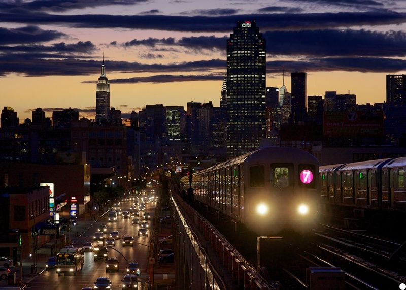
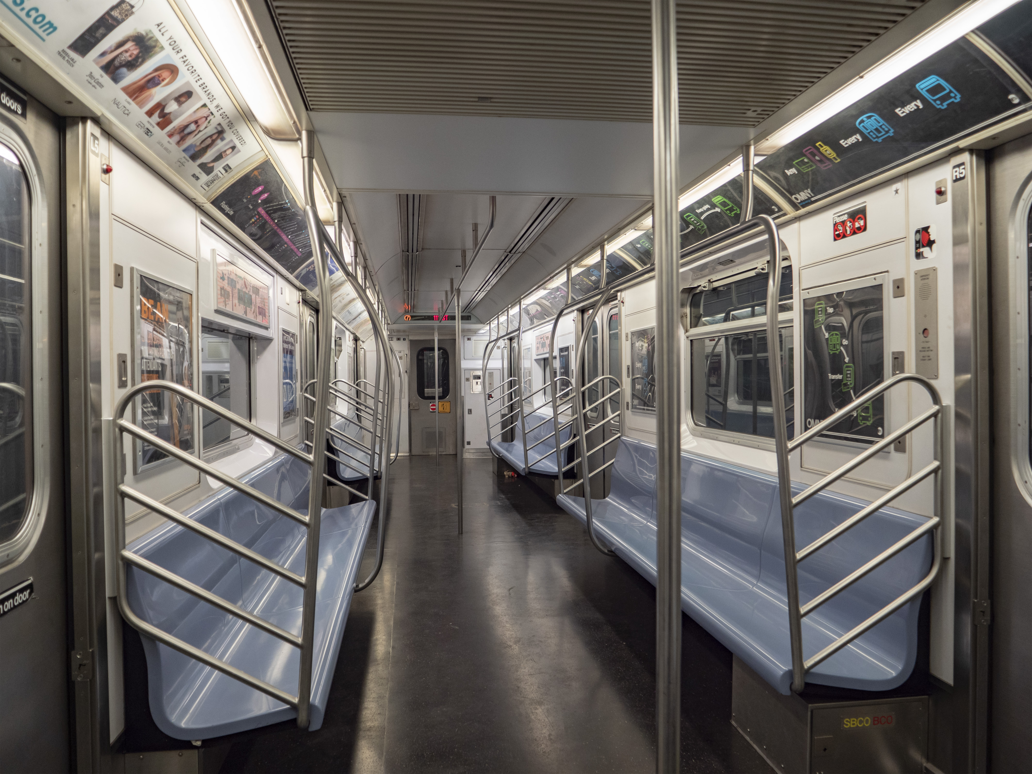
First and foremost... We need to talk! (Yes, I'm talking to you, Google Maps)
Dear Google Maps,
First of all, thank you for being so good at giving me a quick overview of my route at first. When I have strong data and I'm above ground, you're genuinely helpful. But honestly, why do you seem to hate me every time I take the subway?
Whenever I'm on the train, you constantly freeze, or worse, you crash and close out of nowhere, just to mess with me. Then I have to waste time re-entering my starting location and destination all over again.
And riding the subway with you is so stressful. That little blue dot isn't enough...I have to keep scrolling up and down just to figure out where I actually am on the map. The subway announcements are impossible to hear, but you never give me a heads-up either. You never clearly tell me when I need to get off, leaving me sitting there in constant anxiety.
Even once I finally arrive and get off the train, you still don't guide me properly. Am I supposed to turn left or right for the exit? What about when I need to transfer? Why can't you just tell me smoothly instead of making me guess? Because of your vague location tracking, I end up walking a few steps in the wrong direction and having to turn back all the time. Honestly, using you on the subway always feels so sketchy and nerve wracking.
So, I’m officially breaking up with you..! I’m trading your freezing screen and dead zones for something that actually works in the dark, a tangible, hand held paper companion. It’s not me, it’s definitely you.
Sincerely,
Someone who is finally taking the 7 line on her own terms
Instability 🔜 Offline paper structure
Anxiety 🔜 Manual card flipping
Uncertainty 🔜 Step-by-step station guide
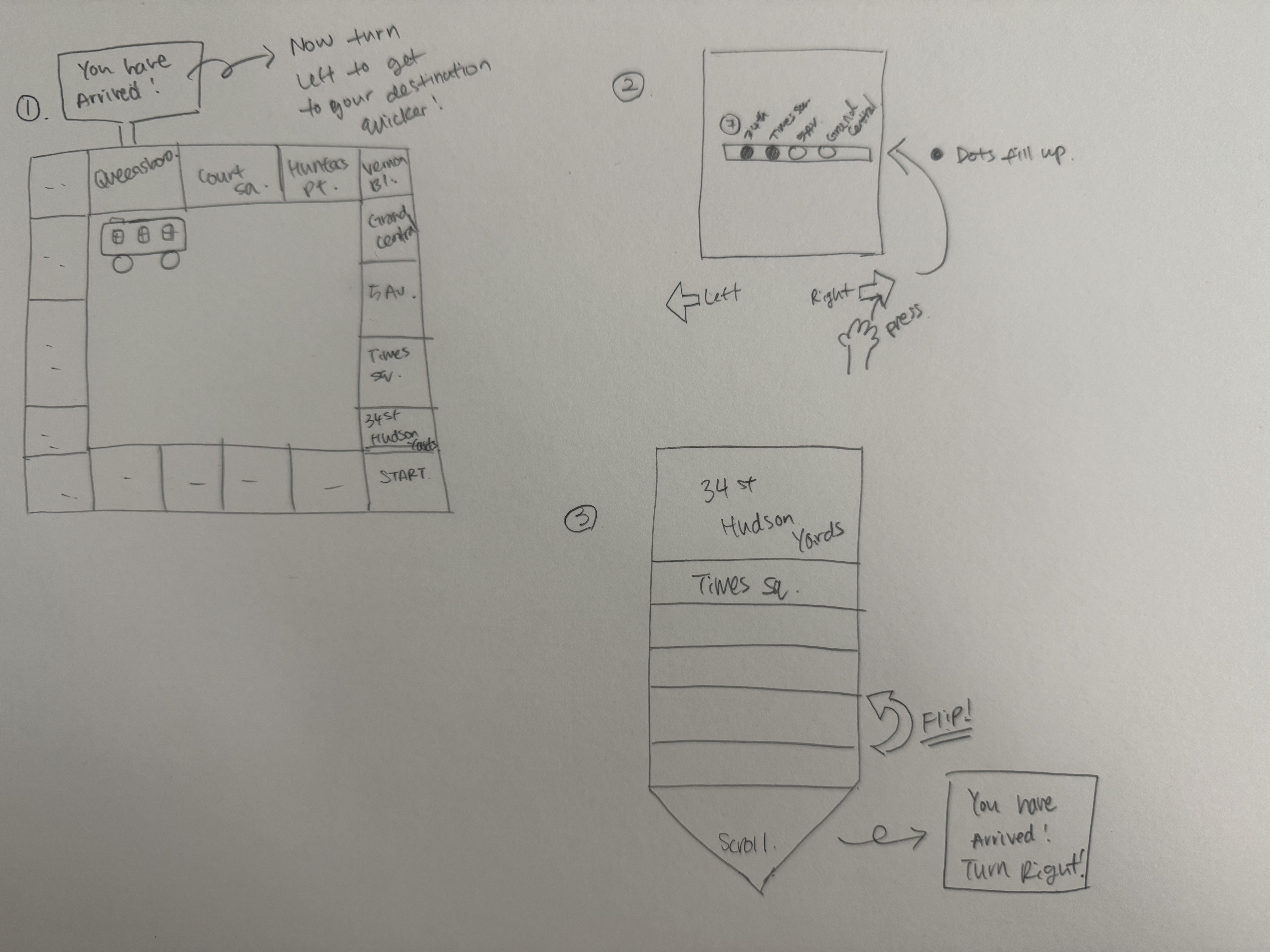
Initial Concept Exploration
1. Subway Board Game:
A physical board game layout mapping the 7 line, featuring a moving train piece and a popup arrival sign when reaching the destination.
Pros: Playful and highly engaging
Cons: Too bulky and completely nonportable for an actual commute
2. Manual Station Tracker
A handheld device with manual, button-activated dots that light up or track progression as you press the button.
Pros: Direct input and tactile engagement
Cons: Requires repetitive effort and is tedious to update manually during a fast moving trip
3. Waterfall Card Flipbook (FINAL CHOICE!)
Cascading paper mechanics where pulling the bottom tab reveals sequential station cards and flipbook panels.
Pros: Highly intuitive, pocket-friendly, and portable
Rationale: Selected as the final concept because it strikes the best balance of form and function, perfectly fulfilling the project's requirement for a tangible, screenfree .
📖 How to Use
1. One-Handed Pocket Portability
Compact and self-contained, the Waterfall Card fits comfortably in one hand, ready for use underground without needing data or battery.
2. Sequential Pull & Cascade
As the train moves from station to station, gently pull the bottom tab. The cascading paper mechanism smoothly reveals upcoming stops one by one, replacing digital scrolling with tactile rhythm.
3. Arrival & Destination Clarity
Upon reaching your destination, the final panel locks into place, giving you instant, clear directions (like "Turn Right for Exit") so you can step off the train with absolute confidence.
Reflection
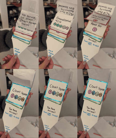
Moving from a screen app to a physical card changed how people navigate the 7 line. Instead of worrying about underground data dead zones or app crashes, users can rely on their hands. By pulling the cards, they can easily follow the station sequence and see clear exit directions without any digital stress.
This design was heavily shaped by the realities of the subway environment, where commuters often have to stand crowded in a moving train while holding onto a pole with one hand. The compact structure and the pull tab mechanic were specifically chosen because they naturally fit this one handed posture. Furthermore, the smooth flipping action transforms what is usually a tense, repetitive check of upcoming stops into a simple, calming physical ritual that grounds the user throughout the trip.
I tested it with two people, and it was surprising how naturally they understood it. Because the design was straightforward, both testers understood how to use it right away and had fun pulling the tabs. However, testing also showed a real limitation: since each person had a different destination, I had to manually adjust the cards for them at the end. This showed that a physical tool needs a more flexible way to handle different end stops.When people tested the prototype, it was surprising how naturally they understood it. Without any instructions, testers immediately grabbed the bottom tab and pulled it, and their quick, curious reaction showed that a physical, screen free tool can make a routine commute much more engaging.
If this interface were to be developed further, I would use more durable and water-resistant materials, like tear resistant paper, to handle daily wear and tear. I would also design modular card inserts so users could easily change their route or switch to other subway lines.Ultimately, this project showed that moving away from screens can help reduce the anxiety and stress of staring at Google Maps, bringing a simple, calming rhythm back to our daily commutes.